I was browsing the internet for images for my 'lighting and colour' blog when I came across an interesting image. It looks very vintage so this led me to research vintage designs. Researching different types of design will help me broaden my ideas, adding more variety to my work.
Vintage clothing is a generic term for new or second hand garments originating from a previous era. The phrase is also used in connection with a retail outlet, e.g. "vintage clothing store." It can also be used as an adjective: "This dress is vintage."
The word vintage is copied from its use in wine terminology, as a more elegant-seeming euphemism for "old" clothes.
Generally speaking, clothing which was produced before the 1920s is referred to as antique clothing and clothing from the 1920s to 1980s is considered vintage. Retro, short for retrospective, or "vintage style" usually refers to clothing that imitates the style of a previous era. Clothing produced more recently is usually called modern or contemporary fashion. Opinions vary on these definitions.
Most vintage clothing has been previously worn, but a small percentage of pieces have not. These are often old warehouse stock, and more valuable than those that have been worn, especially if they have their original tags.
Although the above definition of vintage is about clothing, this can also be related to interiors.
I found a selection of words that sum up 'vintage design'
maturity, enduring appeal; classic, Old or outmoded.
Below are some images of vintage looking interiors.
I love how vintage design takes designs from many years ago and 're-uses' them as such. Some of the above images show a modern twist on vintage design which I think looks very effective.
Saturday, 29 January 2011
Deconstructivism
I discovered Deconstructivism whilst reading through a book for part of my essay I was writing. It immediatly captured my attention and I decided to research the architectural style in more depth.
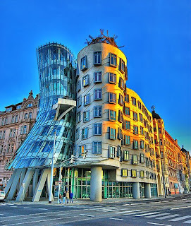
Deconstructivism is a type of architectural style, which goes against all the rules of conventional architecture. Developed in late 1980’s, deconstructivism was started by a group of architects known as the deconstructivists.
The deconstructivism style explains that a building is designed in different parts. The architecture appears to be done in random bits and pieces without any importances given to logic or architecture normalitites.
The main focus is to change conventional rectilinear lines of a normal piece of architecture into non-rectilnear lines, therefore resulting in the external features of a building looking distorted.
I love how the style goes against the rules of architecture, its very inspiring. This for me personally is architecture of the future, pushing the boundries, creating something very different.
Below are some images of example of Deconstructive architecture. This image is an artistic visual. The lines and colour captured my attention. It looks confusing but it is a very unique interesting presentation technique.
Opera House Design
In some fo my lectures we briefly looked at some of the famous opera houses. I found that most of them all seemed to be very modern so therefore led me to research them in more detail. The opera house designs I discovered are very inspiring to me. Below are some images of some of my favourite designs.
Norways Opera House. - The building is situated in Bjørvika, Oslo and houses both opera and other cultural events. It is made from marble and glass. The sheer size of the building is fascinating, the floor area of the base of the building is equivalent to four international standard football fields and measures more than 38,000 square metres. The building boasts three stages and a total of 1,100 rooms.
From the outside, the most striking feature is the white sloping stone roof which rises directly up allowing visitors to walk up and take in views of the city.
Valencia Opera House -
The enormous Valencia Opera House covers an area of 87,000 square meters among which 10,000 square meters is the pool surrounding it. The building is stunning, especially the roof which was built with feathers and two shells on the outer side of the building. It is wrapped in lucent steel and an intricate design of ceramic is found on the outer structure. The roof is supported by two pillars.
The shape of the opera house resembles an egg shell and also a ship, which has round portals. The most striking structure part of the opera house is the two sheaths which form a structure of a blown up ribbon rendering uniqueness.
Copenhagen Opera House - This design is very striking. The outter surface of the building is made from limestone. Canals have been dug to make the Opera look as if it were placed on an island just a bit larger than the building itself. This also meant that bridges were needed, and these bridges were made using very old oak.
The front of the opera was originally meant to have a large glass surface, where you could see the shell of the auditorium from the harbor side however this idea was scraped due to glass 'not aging well'.
Daniel Libeskind
I was researching buildings for my latest assignment and came across 'Toronto's Royal Ontario Musem'. I found this design very unique and inspiring. This then led me to research the designer behind it.
Daniel Libeskind, (born May 12, 1946 in Poland) is an American architect/artist.
His work includes the Jewish Museum (berlin), Grand Canal theatre (Dublin), the Imperial War Museum North, Royal Ontario Museum (Canada) and the London Met University.
His style falls into Deconstructive which goes against all the 'rules' of architecture. Most of his buildings use poured concrete, glass and pre cast concrete. The colour schemes are mainly grey scale which i like.
Below are some images of his work.
Lighting and colour
It is noticable that I don't tend to use much colour within my work. I usually opt for black, white and greys with accent colours. I do like this colour scheme alot, it looks very modern and effect however I feel it is important I challenge myself more by doing somthing different. This would involve using colour in my work which is somthing I find difficult. I am going to look at different colours and how they go together within an interior to compliment/contrast each other.
Another important feature I don't pay enough attention too is lighting. Lighting within an interior is key, it can be essential to create the right sort of atmosphere.
Here are some images of colourful interiors.
Different types of lighting
Downlighters - Usually used within kitchens, bathrooms, shops etc. They can be in rows and look quite formal. There not particularly suitable for use within bedrooms etc as the lights are very harsh.
Pendant lights- These usually hang from the centre of the room. Used alone, they're the main cause of the 'interrogation cell' look. Although they're a good starter for general lighting, they need a boost from other sources.
They tend to flatten shadows and cast a dim light. It helps to fit a dimmer or hang them on an adjustable flex so you can change the height or clip them out of the way. They come in a myriad of styles, from the ubiquitous paper lantern to chandeliers.
Subscribe to:
Posts (Atom)